








A game does not need huge graphics or expensive effects to feel premium. Sometimes, one very small user interface choice can change the whole experience. Players may not even notice it at first, but they can feel the difference.
A polished game often feels smooth, clear, and easy to use. Menus open without confusion. Buttons feel easy to understand. Text sits in the right place. Sounds match actions. Nothing feels crowded or out of place.
One of the smallest choices that can create this feeling is good spacing in the UI.
It may sound simple, but spacing has a huge effect on how a game feels. The distance between buttons, text, icons, and other elements can make the interface feel calm and expensive instead of messy and cheap.
Why Spacing Matters So Much
When people look at a game menu, their eyes need to understand what they see very quickly. If everything sits too close together, the screen can feel busy. Players may struggle to find the right button or understand which items belong together.
Good spacing gives each part of the interface room to breathe. It creates a clear visual order. Players can see what matters first and what matters next.
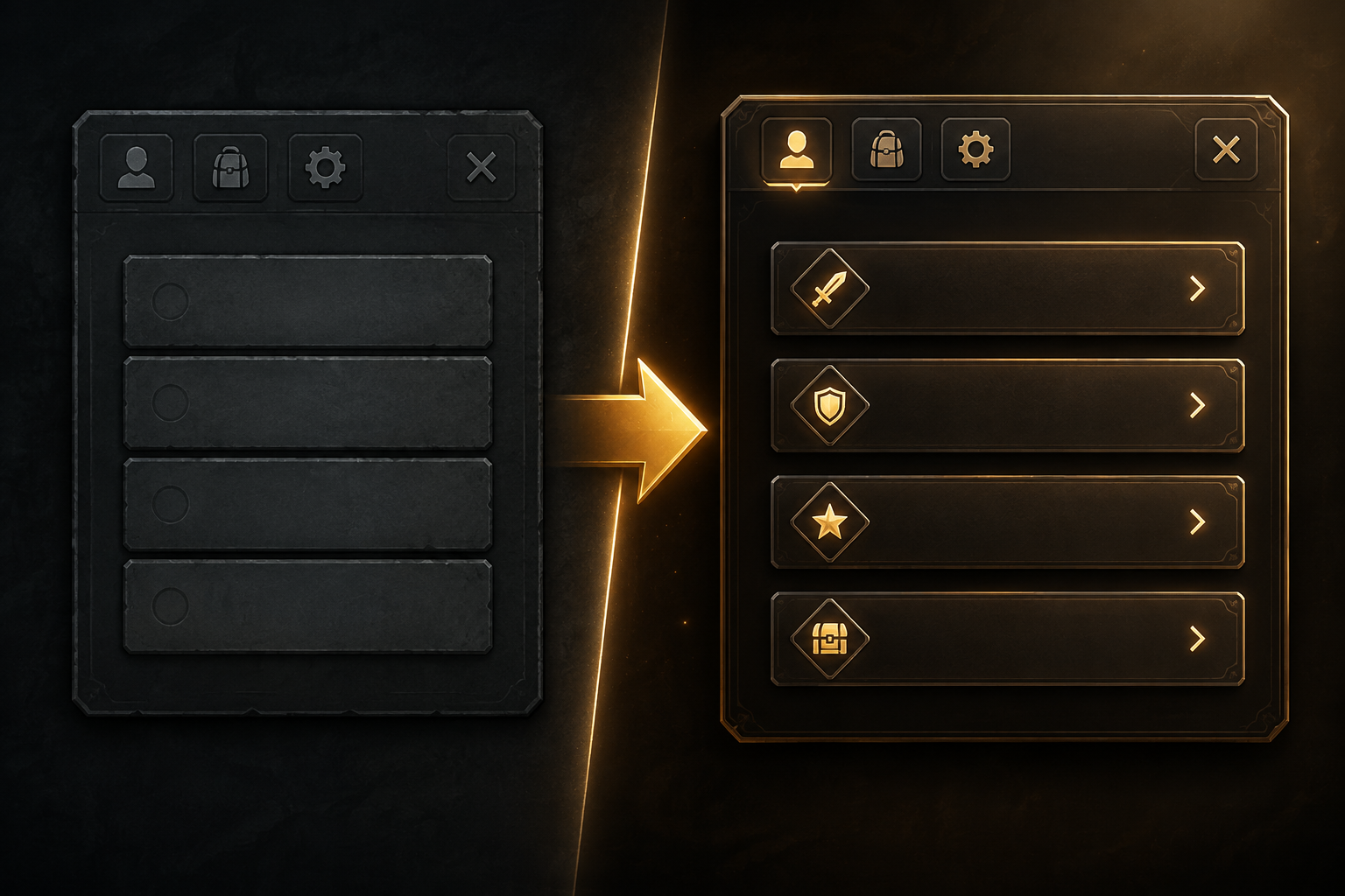
Think about a simple settings menu. Imagine five buttons placed almost on top of each other. The labels may be clear, but the whole menu can still feel uncomfortable.
Now imagine the same five buttons with enough space between them. The screen feels cleaner. Each choice becomes easier to see. The game suddenly feels more polished, even though nothing else has changed.
That is the power of a small UI decision.
Small Details Create Big Feelings
Players judge quality through small details. They may not say, “The spacing between these buttons is excellent.” Instead, they may simply say, “This game feels good.”
That feeling comes from many small choices.
A button can have the right size. Text can have enough room around it. Icons can stay aligned. Menus can use the same gap between similar items. Important actions can have more space around them than less important ones.
These details create a sense of order.
When an interface feels ordered, players trust it more. They feel that the developers cared about the experience. That care can make a game feel more complete.
This is especially important in games with complex systems. RPGs, strategy games, simulation titles, and action games can have many menus and controls. A clean interface helps players deal with all that information without stress.
The Premium Feeling Is About Control
A premium UI does more than look nice. It makes players feel in control.
When a player presses a button, the result should feel clear. The game should show that it received the input. A small change in color, size, sound, or position can confirm the action.
This does not need to be a large animation. A tiny response can be enough.
For example, a button may become slightly brighter when the player moves the cursor over it. When the player selects it, the button may move by a few pixels or produce a soft sound.
These details tell the player, “Yes, your action worked.”
That clear response makes the interface feel alive.
Timing Can Change Everything
Another tiny choice is the timing of UI feedback.
A menu that appears instantly can feel fine. But a very short transition can make the same menu feel more natural. The key is balance. If the effect takes too long, it becomes annoying. If there is no response at all, the interface can feel cold.
Good UI timing often sits in a very small range. A quick fade, a tiny movement, or a short sound can make a major difference.
The player does not need to think about the effect. It should simply feel right.
This is one reason premium games often seem smoother than basic ones. Their interfaces respond with care instead of simply changing from one state to another.
Consistency Makes a Game Feel Expensive
A game can have beautiful menus and still feel unfinished if its UI lacks consistency.
Buttons should follow the same basic rules across the game. Similar actions should look similar. Text should follow a clear system. Icons should have a related visual style.
For example, if one menu uses a certain button shape, another menu should not suddenly use a completely different style without a good reason.
Consistency helps players learn the interface. Once they understand one part of the game, they can use that knowledge somewhere else.
It also creates a stronger visual identity.
The player may not know why the interface feels professional, but the repeated patterns create that impression.
Give Important Things More Space
Not every part of a UI needs the same amount of space.
A game can use spacing to show importance. A major action can have more room around it. Smaller information can sit closer together.
Imagine a pause menu with three choices: Resume, Settings, and Quit. Resume is usually the most important option. Giving it clear space and strong visual focus makes the menu easier to understand.
This also helps prevent mistakes.
A player should not accidentally select a dangerous or permanent action just because two buttons sit too close together.
Good spacing is therefore not only about beauty. It also improves usability.
Less Can Feel Like More
One common mistake in game UI is the desire to show everything at once.
Developers may have lots of useful information to display. But more information does not always create a better experience.
A premium interface knows what to hide.
The player does not need every piece of information on the screen at the same time. Some details can appear only when needed. Other information can stay inside a menu.
This creates a cleaner experience.
A simple screen can feel more advanced than a crowded one because it shows confidence. It tells the player that the game knows what matters.
Sound Completes the Experience
Visual UI choices become even stronger when sound supports them.
A small click when a button is selected can make the action feel real. A different sound for confirmation can make the result clear. A soft sound when a menu opens can give the interface more character.
Again, these are tiny details.
But when visual feedback and sound work together, the interface can feel much more responsive.
The important part is restraint. Too many sounds can become tiring. Premium design usually knows when to stay quiet.
The Player Should Never Fight the UI
The best interface almost disappears.
Players should not have to stop and ask where a button is. They should not need to guess what an icon means. They should not feel lost because one menu works differently from another.
When the UI works well, the player can focus on the actual game.
That is the real goal.
A good interface does not try to become the star. It supports the player and stays out of the way.
Small Choice, Huge Result
The idea is simple: premium game feel often comes from small details, not huge features.
Better spacing, clear feedback, good timing, consistent layouts, useful sounds, and less clutter can change how players experience a game.
None of these choices require a massive budget. They require attention.
A developer can take an existing menu and improve it without changing the core game at all. Move elements apart. Give important choices more room. Make button feedback clearer. Remove information that does not need to stay on screen.
The result can feel surprisingly different.
That is what makes UI design so powerful. A tiny choice can affect every second a player spends inside a menu.
Players may never know exactly why a game feels premium. They simply know that it feels good.
And sometimes, that feeling comes down to something as small as the space between two buttons.
ALSO READ: Why Some Open Worlds Feel Empty Despite Huge Maps